Art · 6 min read
How Hokusai's Great Wave Was Designed, Carved, and Printed
A production walkthrough showing how specialist labor and changing materials shaped Hokusai's best-known print.
How Hokusai's Great Wave Was Designed, Carved, and Printed
Katsushika Hokusai designed Under the Wave off Kanagawa, commonly called The Great Wave, around 1830–32 as part of the series Thirty-six Views of Mount Fuji. The image bears his artistic name, but the physical print was a coordinated product. A publisher financed and marketed the series. Specialist carvers translated a drawing into cherry-wood blocks. Printers applied water-based pigments to those blocks and pressed paper by hand. Differences among surviving impressions show that color, alignment, and even block condition changed during the print run.
Describing this system does not reduce Hokusai's authorship. It clarifies what authorship meant in commercial Edo-period woodblock publishing. The artist supplied the design; other skilled workers made each impression possible. Many of their names are not preserved for this print, so the production can be reconstructed more confidently than individual credit.
A publisher commissioned a marketable series
The publisher Nishimuraya Yohachi, whose firm used the name Eijudō, issued the Fuji series. The Metropolitan Museum of Art notes an advertisement near the New Year of 1831 promoting views of Mount Fuji and emphasizing the use of imported Prussian blue. Publishers selected projects, commissioned artists, coordinated production, owned the blocks, and handled distribution. Their commercial judgment shaped format, sequence, materials, and the number of impressions.
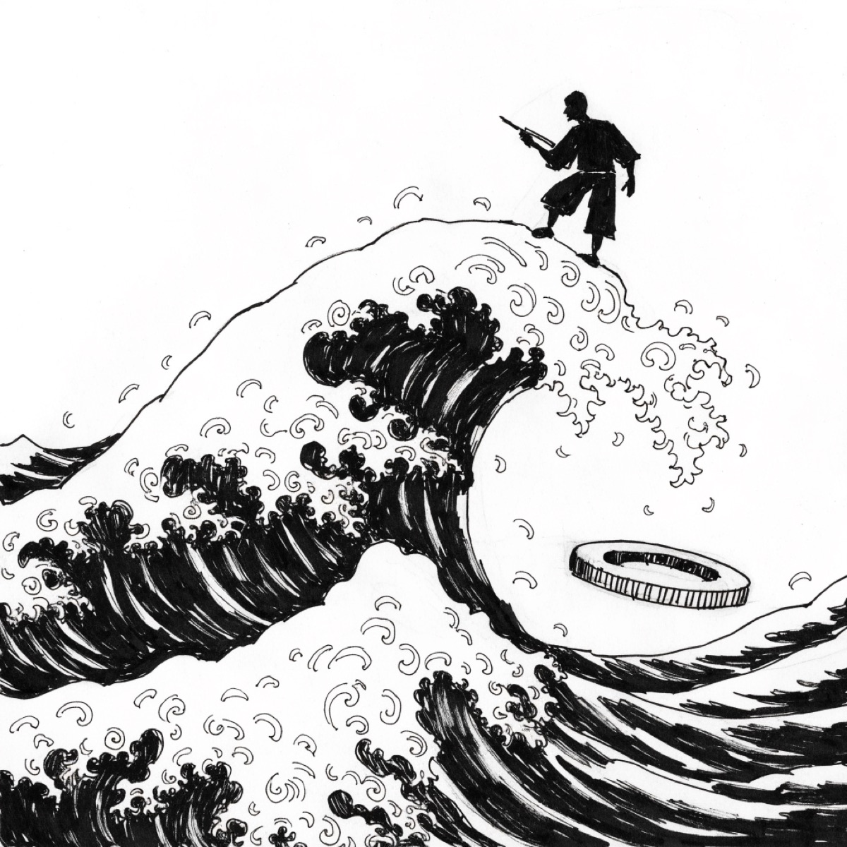
Hokusai's composition combines three boats, rowers crouched against the sea, the distant cone of Fuji, and a wave whose curling tips break into foam. The title places the scene offshore from Kanagawa. It is tempting to treat the picture as a record of one observed wave, but it is a designed image made within Edo-period conventions for prints of places. Its low horizon and cropped forms create immediacy; the visual echo between wave and mountain makes scale legible.
The finished design would be prepared as a hanshita-e, a final drawing for transfer. That sheet was not simply kept as a master artwork. As the British Museum explains, it was pasted face down onto a block of mountain cherry. The paper was thinned so the lines could guide cutting. Carving therefore consumed the transfer drawing. Survival of the print does not imply survival of Hokusai's exact final sheet.
The key block fixed the lines
A specialist carver cut away wood around the design's lines, leaving a raised relief surface. The resulting key block printed the principal outlines and inscriptions. The work demanded interpretation. A cut that was too deep, too wide, or misplaced could alter a contour. Fine lines around faces, boats, foam, and text required controlled knife work along the grain.
The first proofs from the key block guided preparation of separate blocks for colors. Each color area needed a relief surface that would receive pigment while surrounding wood remained lower. Blocks could be carved on both sides. Registration marks, known as kentō, were cut into the blocks so the printer could place each sheet in a consistent position.
The names of carvers and printers were sometimes recorded in Japanese print culture, but museum catalogues do not identify them securely for The Great Wave. The absence is an archival limit, not evidence that the labor was unimportant. The British Museum's object record states that Hokusai designed the image while blocks were made in a master carver's workshop under the publisher's commission.
Printing was repeated handwork
The printer dampened handmade paper, brushed pigment and binder onto a block, aligned the sheet against registration marks, and rubbed its back with a baren. The sheet was lifted, placed on another block, and printed again for another color. Pressure, moisture, pigment concentration, brush movement, and alignment affected the result. A polychrome impression might require several block contacts.
Scientific analysis at the Metropolitan Museum found that early impressions used Prussian blue in more than one way. Printers combined it with traditional indigo and used layered or double printing to achieve tonal effects. Prussian blue was a synthetic pigment developed in Europe and available in Japan through trade. It resisted fading better than some organic blues and became central to the series' visual identity.
This finding corrects a simplified material story. The printers did not merely replace indigo with one new pigment. They adjusted mixtures and sequences. The Met's account attributes part of the print's saturated contrast to their handling of the colors. That is evidence of production expertise that a catalogue credit line can compress.
Surviving impressions record change
Woodblocks wear. Fine raised areas can break, lines can broaden, and repeated wetting can affect the surface. Publishers could repair or recut blocks and change the color scheme to sustain sales or reduce costs. Printers also varied the amount and placement of pigment. Consequently, two authentic Edo-period impressions from the same design need not look identical.
The British Museum's study by Matthi Forrer and colleagues compares impressions to reconstruct stages in The Great Wave's production. Earlier examples tend to preserve sharper details and particular color effects; later ones can show worn lines and altered printing. Researchers use breaks in the block, registration, paper, and pigment to propose sequences. The evidence does not yield an exact date or worker for each surviving sheet.
Estimates of the total print run vary. The British Museum gives a broad range of roughly 5,000 to 15,000 Edo-period copies. Such figures are reconstructions, not surviving production accounts. Many impressions were handled as affordable commercial images rather than protected as singular paintings. Loss, trimming, fading, and later collecting make the original quantity uncertain.
The variability changes how “the original” should be understood. There was an original design and an original set of blocks, but there were numerous period impressions. Museums may privilege an early, well-preserved state because it is closer to the blocks' unworn condition. A later impression is still historically informative: it records continued demand, workshop decisions, and material aging.
Labor, attribution, and global fame
Hokusai's name became the organizing attribution as the print circulated abroad in the nineteenth century and entered European and American collections. That focus makes sense because the composition belongs to his practice and the series was advertised under his name. It can also hide the publisher's risk, the carver's translation, and the printer's control of color.
Modern ideas of a single artist making a unique object fit uneasily with this production. The print is both Hokusai's design and a multiple manufactured through specialized manual labor. “Manufactured” here does not mean mechanically identical. Each sheet passed through hands, and the system produced controlled variation.
The division of labor also set constraints. Hokusai designed for relief carving, registration, available pigments, paper size, and a commercial price. Carvers and printers could realize effects only within the blocks and instructions available, while their decisions shaped the visible result. The publisher could authorize changes during the run. Authorship was structured cooperation rather than isolated execution.
What the object supports
Museum records, technical imaging, pigment analysis, and comparisons among impressions establish the main sequence: commission, design, transfer, key-block carving, color-block preparation, registration, repeated hand printing, and distribution. They also show that Prussian blue and indigo were handled in layered ways and that impressions changed over time.
The record is weaker on individual workers, exact edition sizes, and the day-to-day instructions exchanged in Eijudō's shop. Those gaps should not be filled with imagined dialogue or precise production totals. The Great Wave is famous as a Hokusai image, and the evidence supports that attribution. Looking closely at how it was made adds another factual claim: the object viewers encounter was formed by a production system whose unnamed specialists left evidence in cut lines, registered colors, and variations between sheets.
Sources
4 sources, none of them with a link, so treat them as reading, not proof.
- Metropolitan Museum of Art, “The Great Wave: Anatomy of an Icon,” technical study of pigments and printing sequence.
- British Museum, Hokusai resources: “How Were Hokusai's Prints Made?”
- British Museum, “The Making and Evolution of Hokusai's Great Wave,” comparative study of impressions.
- British Museum collection record for Under the Wave off Kanagawa, including workshop and publisher context.